
Currently open to new clients
Barnone
What we did
Industry
Retail
Description
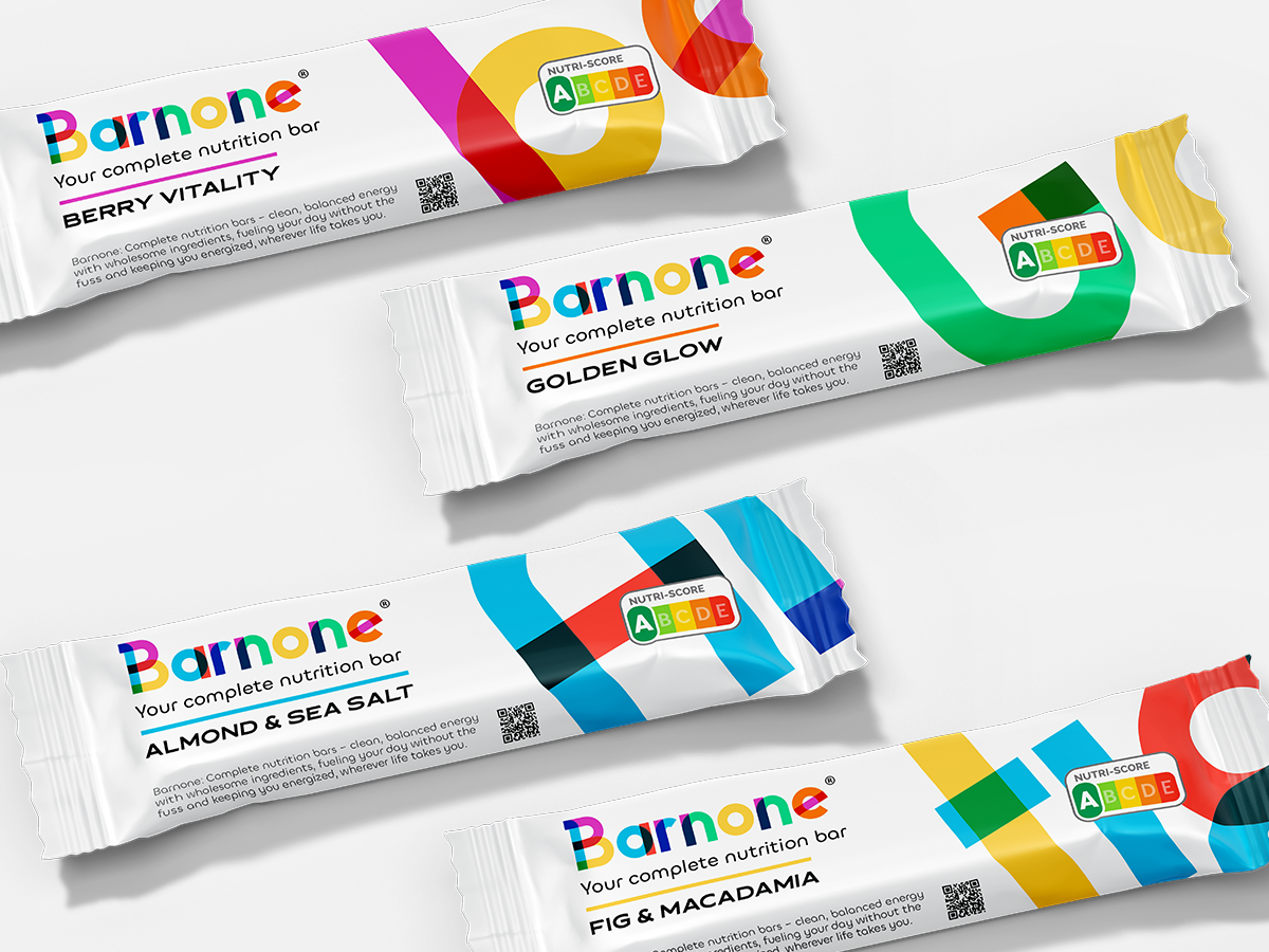
Barnone approached us with a challenge to revitalise their entire brand image. They sought a fresh, modern look that conveyed their commitment to clean, balanced nutrition without the clutter. The goal was to create a visual identity that felt both accessible and premium, appealing to a broad audience while maintaining a focus on quality and simplicity. We began by redesigning their logo and overall brand image, simplifying the design elements to achieve a clean and contemporary aesthetic. The new logo embodied the brand’s core message: straightforward, no-compromise nutrition.
We started the project by tackling the packaging first, ensuring that every detail, from the individual bars to the delivery boxes, felt fresh and modern. The packaging was updated to reflect the clean, minimalist approach of the new branding, with bold typography and vibrant colours representing the wholesome ingredients inside each bar. We also refreshed the range of product flavors, ensuring each one had a unique, appealing design that matched the overall sleek and modern feel.
The rebranding of Barnone Complete Nutritional Bars successfully positioned the company as a clean, premium choice in the competitive nutrition bar market. The updated logo, packaging, and flavour range have enhanced brand recognition, appealing to health-conscious consumers who value simplicity and quality. Since the relaunch, Barnone has experienced increased engagement, with customers appreciating the modern, clean approach to nutrition that the brand now embodies.